
Sign Design Tips: 8 Tips on Creating Effective Signage

Giuliano Marinho, September 9, 2020
Read more about the author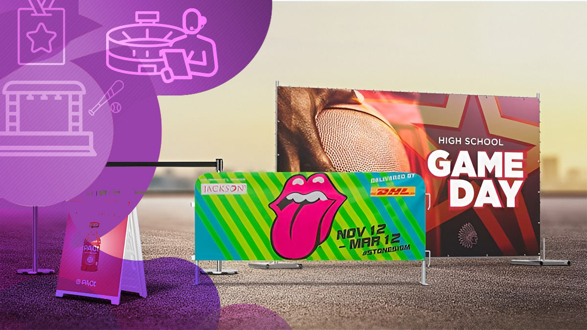
Whether you're promoting a business, directing foot traffic, or building brand awareness, your signage needs to do one thing above all else: work.
The most effective signs are seen instantly, understood immediately, and remembered long after someone has walked past. Sounds straightforward, but getting there takes more thought than most people expect.
From roadside billboards to A-frame sidewalk signs and construction site banners, the principles behind great sign design are the same.
In this guide, we'll walk you through eight proven sign design tips that help your signage cut through the noise, communicate your message, and drive real results. No matter where it's displayed.
Best Tips for Designing a Sign
Before diving into the details, here's a quick overview of what separates forgettable signage from signage that actually works:
- Keep the message focused: one clear idea per sign
- Tell people what to do next: include a call to action
- Stay consistent with your brand: colors, fonts, and tone should match
- Choose high-contrast colors: visibility is everything
- Use clean, readable fonts: save the decorative fonts for logos only
- Use high-resolution images: low quality signals low quality
- Place it where eyes already go: location determines impact
- Work with professionals: great design pays for itself
Read on for a deeper look at each of these tips for designing a sign that gets noticed.
1. Keep It Simple
Clutter is the enemy of effective signage. The most impactful signs lead with a single, clear message. One that can be absorbed at a glance, without the viewer needing to stop and decode it.
This is especially true for yard sign design tips: passersby typically give a sidewalk or A-frame sign no more than a second or two. If they can't tell what you're offering in that window, they'll keep moving. The same principle scales all the way up to highway billboards, where drivers have even less time to engage.
When drafting your message, ask yourself: What is the single most important thing I want someone to know? Lead with that and cut everything else.
Pro tip: If you find yourself shrinking the font to fit more text, that's a sign (no pun intended) that you have too much copy.
2. Make It Actionable
A sign that informs but doesn't direct is a missed opportunity. Effective signage doesn't just describe: it guides. Every sign should include some form of call to action that tells the viewer exactly what to do next.
Compare these two approaches:
- "We have the best crowd control equipment on the market."
- "Get the best crowd control equipment on the market — visit us today."
The second version is more engaging because it invites a response. Beyond the headline, make it easy for people to act: display your website URL, phone number, or a physical direction ("Turn right at the corner"). Remove the guesswork. The more someone has to think about how to contact you, the less likely they are to do it.
3. Ensure It Matches Your Brand
Brand consistency isn't just a marketing buzzword, it's directly tied to trust. When your signage looks and feels like your other brand materials, it reinforces recognition. When it doesn't, it creates confusion.
Think about it from a customer's perspective: if someone sees your billboard on the way to work and then walks past your storefront later that day, those two touchpoints should feel like they belong to the same brand. Mismatched colors, fonts, or messaging breaks that connection and can undermine the credibility you've worked to build.
This is especially relevant for businesses that use perimeter or construction site signage. A product like Sonco's Custom Vinyl Banner (70% Blockage) turns functional fencing into a branded surface, but only if the design actually reflects your brand. A generic or off-brand graphic on a high-visibility banner is a missed opportunity at scale.
Business sign design tips around branding: always use your official brand colors, approved typefaces, and consistent logo placement. The more consistently consumers encounter your visual identity across channels, from your website to your job-site fence, the more likely they are to recognize you, and trust you, when it counts.
4. Use High Contrast Colors
Visibility starts with contrast. Classic pairings like black on white, purple on yellow, or orange on blue aren't arbitrary, they're high-contrast combinations that are easy to read from a distance, in motion, and in varying light conditions.
Even in an environment with zero competing signs, your signage is fighting for attention against traffic, noise, phone screens, and every other distraction in a viewer's immediate environment. High contrast helps you win that battle. When colors are too similar in tone, text blends into the background and your sign effectively disappears.
Color choices also have an emotional dimension: colors that clash or feel visually uncomfortable can actually make people look away. The goal is to be easy on the eyes and impossible to ignore, that combination only comes from getting contrast right.
5. Use the Least Controversial Font
Typography makes or breaks readability, and sign design is no place to experiment with hard-to-read typefaces. The golden rule: if you have to wonder whether a font is readable, it isn't.
Decorative or thematic fonts can work within a logo, where they're seen at close range and in context. But for the body of your sign (the message itself) stick to clean, universally recognized typefaces like Helvetica, Arial, Calibri, or Cambria. These fonts are legible at a distance, scale well when printed large, and don't distract from the message.
Even well-intentioned choices can backfire: a medieval-style font for a renaissance festival might seem fitting, but if it takes more than a second to read, it means fewer people actually register what's being advertised. Clarity always beats character.
6. Use Properly Rendered, Photo-Quality Images
A pixelated image on a printed sign does more damage than having no image at all. It signals carelessness, and by extension, it signals something unflattering about your brand.
The challenge is that images that look sharp on a screen can fall apart when printed at large format. A standard web image blown up to billboard scale will come out blurry and unprofessional.
Sign printing requires high-resolution source files, and that often means working with a professional who understands the specifications for each format.
If you're investing in signage, invest in the right files from the start. The visual quality of your sign is a direct reflection of the quality of your brand. Viewers notice, even when they don't consciously think about it.
7. Pick the Right Place to Display It
Even a perfectly designed sign will underperform if it's placed somewhere people won't see it. Placement strategy is one of the most underrated elements of sign design tips for businesses.
Think about where your target audience already is and what they're doing when they're there. A construction site banner makes sense at the project location, that's where potential buyers and neighbors will see it.
An A-frame sign belongs directly outside your front entrance, facing foot traffic from both directions. If your business is near a highway exit, tall and large-format signage can capture impulse stops from drivers who wouldn't otherwise know you're there.
The core principle: the more eyes on your sign, the more valuable that placement becomes. Don't just find a spot. Find the spot.
8. Sign Design? Hire a Professional Team
All of the above tips require judgment, design skill, and technical know-how to execute properly. Great advertising space can be completely squandered by a design that misses the mark, and unfortunately, that happens more often than it should.
Working with an experienced signage team means your design is optimized for the format, the placement, and the audience from the very beginning.
At Sonco, our in-house designers specialize in creating signage that checks every box: visible, on-brand, properly rendered, and strategically placed. From barricade covers and fence screens to stage scrims and feather flags, we handle every detail so your signage makes the impact it's meant to.
Do's and Don'ts of Sign Design
Good sign design comes down to a handful of decisions — and knowing which mistakes to avoid is just as important as knowing the best practices. Here's a quick reference to keep your designs on track:
| ✅ Do | ❌ Don't |
|
|
Examples of Well-Designed Signs
The best way to understand what great signage looks like in practice is to see it in action. Here are two real-world examples of signage done right.
Veteran: Bold, Purposeful Brand Visibility
Veteran's campaign with Sonco is a strong example of how large-format signage can reinforce brand identity while creating maximum visibility in the right environment.
The design choices (from color palette to messaging hierarchy) reflect a clear understanding of who the audience is and what the sign needs to communicate.
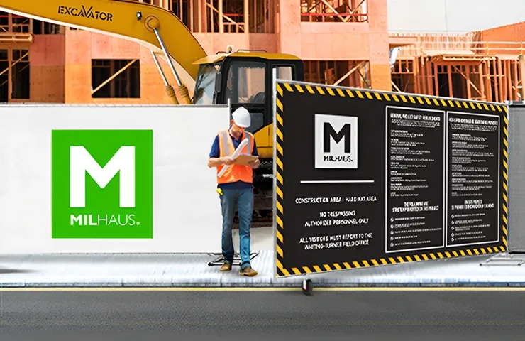
Milhaus: Strategic Signage for a Real Estate Brand
Milhaus, a nationwide real estate development company, used Sonco's signage at their construction job sites to promote upcoming apartment communities to potential residents in the area.
Rather than listing every amenity available, their sign highlighted just one compelling hook driving curiosity and website traffic. The signage was placed around temporary job-site fencing, turning a functional perimeter into a powerful marketing tool.
Personalize Your Own Material with Sonco!
Your signage is one of the most visible expressions of your brand: it deserves the same care and strategy as any other marketing investment.
At Sonco, we work with businesses of all sizes to create custom signage that's built to perform: designed for impact, produced at professional quality, and matched to the exact environment where it will be displayed. Whether you need construction site fencing graphics, event banners, barricade covers, or large-format yard signs, our team is ready to bring your vision to life.
Ready to get started? Request a quote from Sonco today and let our in-house design team help you create signage that gets noticed and gets results!.
Trend now

Theme Park Safety: Avoiding Fines and Accidents with Crowd Control
Learn how crowd control products help keep theme parks safe, avoid accidents, and improve operations. Explore SONCO’s solutions for better crowd management.

Anti Scale Fence for Temporary High-Security Needs
Learn what an anti scale fence is, how it works and when to use one. Covers climb resistance, projectile protection, accessories and deployment best practices.

Why Bike Rack Barricades Are the Go-To Choice for Crowd Control
Explore why bike rack barricades are the go-to for crowd control. Learn how these versatile, durable barriers keep events, construction sites, and more organized.